7. Plotting point data#
PolarToolkit also supports some plotting of point data (non-gridded). Here we will download a dataset and make a simple plot.
Import the necessary modules
[1]:
%load_ext autoreload
%autoreload 2

from polartoolkit import fetch, maps, regions
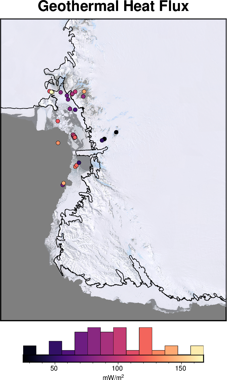
Fetch a pandas dataframe of point measurements of Antarctic geothermal heat flux.
[2]:
df = fetch.ghf(version="burton-johnson-2020", region=regions.victoria_land, points=True)
df.describe()
[2]:
| lat | lon | top (m) | GHF | Elevation (m.a.s.l.) | x | y | |
|---|---|---|---|---|---|---|---|
| count | 40.000000 | 40.000000 | 21.000000 | 40.00000 | 27.000000 | 40.000000 | 4.000000e+01 |
| mean | -76.651405 | 164.625446 | 79.515238 | 93.96425 | -511.370370 | 385506.781862 | -1.403849e+06 |
| std | 1.022481 | 2.106831 | 83.861870 | 32.56072 | 516.276994 | 56561.159260 | 1.114094e+05 |
| min | -77.889444 | 158.840000 | 0.000000 | 25.00000 | -1060.000000 | 295055.798355 | -1.659851e+06 |
| 25% | -77.579550 | 163.511700 | 1.520000 | 74.57500 | -889.000000 | 350410.933318 | -1.470873e+06 |
| 50% | -76.887990 | 164.990000 | 60.000000 | 91.50000 | -870.000000 | 390975.335529 | -1.383358e+06 |
| 75% | -76.040000 | 166.108330 | 150.000000 | 117.00000 | 48.000000 | 397751.013322 | -1.298559e+06 |
| max | -74.483300 | 168.166700 | 260.000000 | 167.47000 | 349.000000 | 561346.437658 | -1.287180e+06 |
Use the basemap function to make a figure instance, and add the points to that.
[3]:
fig = maps.basemap(
    region=regions.victoria_land,
    title="Geothermal Heat Flux",
    imagery_basemap=True,
    imagery_transparency=50,
    coast=True,
    hemisphere="south",
    points=df,
    points_cmap="magma",
    points_fill="GHF",
    points_pen=".2p,black",
    colorbar=True,
    hist=True,
    hist_bin_num=15,
    cbar_label="mW/m@+2@+",
)

fig.show(dpi=200)